FrugalPlot User Manual – v0.1¶
FrugalPlot is the dedicated plot utility for FrugalEDA, built on the FrugalPlot and QCustomPlot libraries. It loads and displays simulation and measurement data from JOINUS-D and L2SPICE with interactive, trackable plots.
Part I — Using FrugalPlot¶
1. FrugalPlot interface¶
- The FrugalPlot interface offers numerous explanatory tooltips. Whenever you hover the mouse cursor over an item, you will usually find the corresponding help information.
- A few FrugalPlot features use contextual menus. Right-clicking on a zone often reveals more options. For instance, each graph can be saved in high resolution in PDF or JPG format by right-clicking on the white background of the corresponding graph.
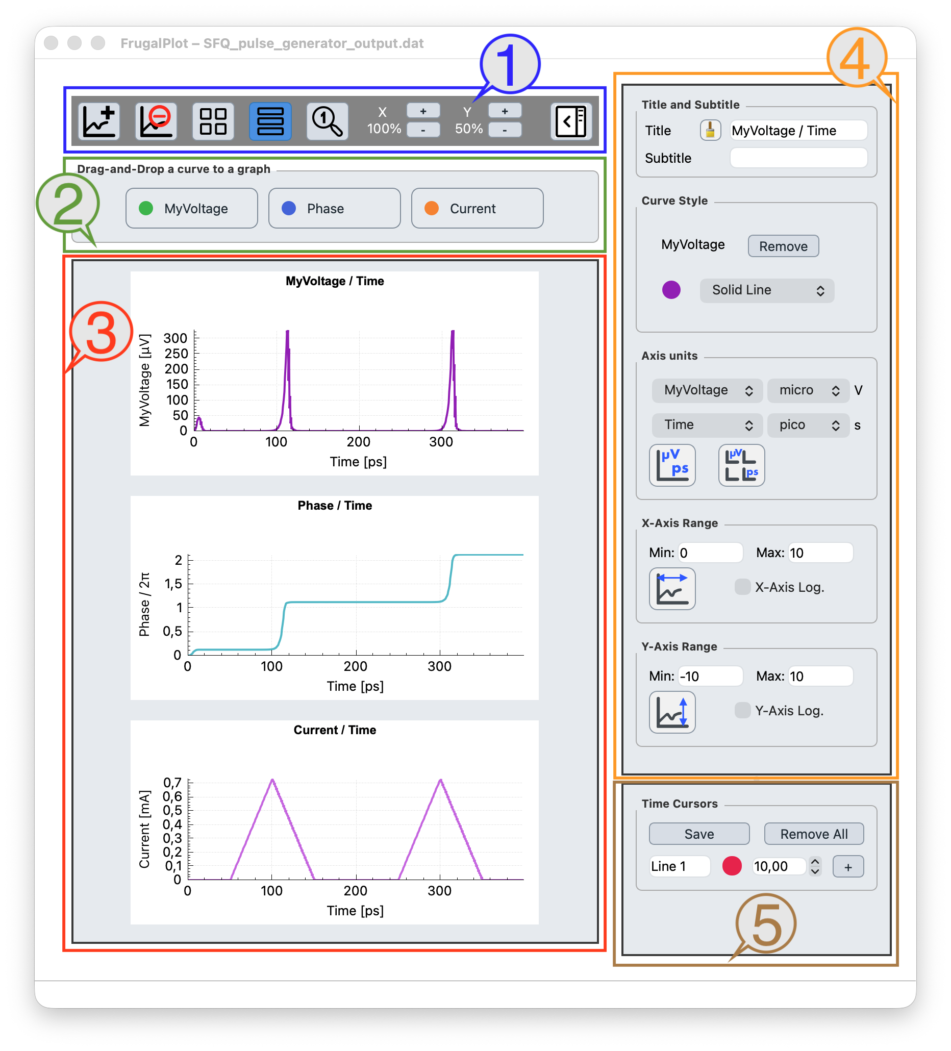
1.1. Blue frame – toolbar icons (left to right)¶
- Add a graph: an empty graph is added at the bottom of the graphs layout, ready to be filled with curves.
- Delete a graph: select it by clicking on its white background, then click the delete icon.
- Grid layout for graphs: all graphs are organized in a grid layout, which adjusts automatically to the window size and to the zoom level of the graphs.
- Stacked layout for graphs: stacks all graphs vertically when the horizontal zoom is set to allow only one graph per row. This is particularly useful for analyzing multiple digital data sets. In stacked mode the x-axis scale stays consistent across all graphs, making data timing easy to compare.
- Default zoom icon: restores all graphs to their initial zoom level.
- X- and Y-zoom are available globally for all graphs.
- Parameter panel icon: toggles the right-hand parameter panel.
1.2. Green frame – chips to select data¶
- Each column in the data file is represented by a chip, whose name is either converted (as explained in §4; examples: Phase, Current) or kept as is (example: MyVoltage) when it does not match a recognized physical quantity.
- You can click, drag and drop any chip from the green frame onto any graph in the red frame to organize the curves as you wish. Multiple curves can be superimposed on the same graph, but only two distinct physical quantities are allowed (for instance, voltages on the left y-axis and currents on the right y-axis).
1.3. Red frame – layout for graphs¶
- Each graph initially displays one curve corresponding to one column of the data file. The x-axis of all graphs is the same and corresponds to the first column of the file.
- Curves can be moved or copied from one graph to another. To do this, leave the mouse cursor on the white background of any graph and follow the on-screen instructions:
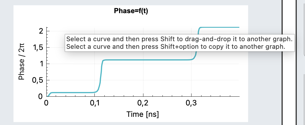
- To remove a specific curve from a graph, click on it and then remove it from the Curve style frame in the right-hand panel (orange frame).
- Each graph can be saved in high resolution in PDF or JPG format by right-clicking on the white background of the corresponding graph:
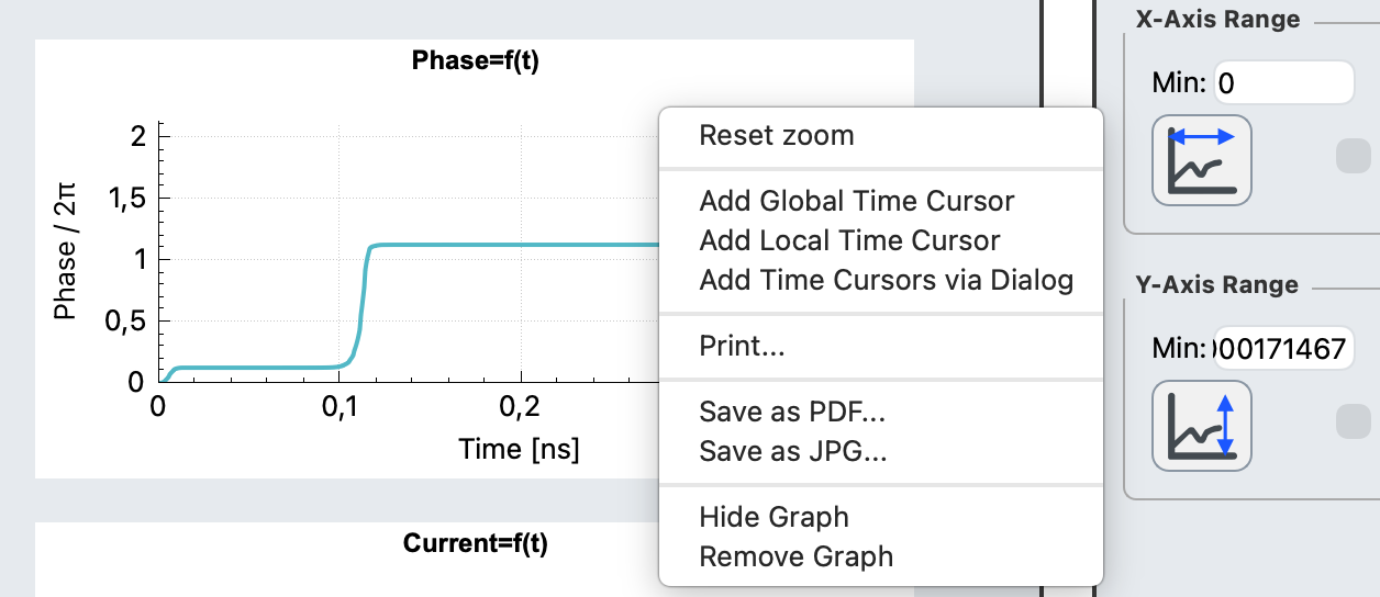
- Time cursors can be added to one or all graphs by right-clicking on a graph. See §2.
- Graphs that have been hidden can be shown again by right-clicking on the grey background of the red frame.
2. Time cursors¶
Time cursors are vertical markers placed at a given x value to read off and compare curve values across graphs. They are managed from the X-axis Cursors panel and from each graph's right-click menu.
- Add a cursor: right-click on a graph and choose the add-cursor entry, or use the + button of the X-axis Cursors panel.
- Global vs. single graph: a global cursor is drawn on every graph that shares the same x quantity as the graph it was created on (a cursor at 3 ns has no meaning on the voltage axis of an I–V plot, so it is not drawn there). A per-graph cursor stays on its own graph only.
- Move a cursor: drag it horizontally; the readout follows.
- Remove a cursor: use the Remove cursor button next to its entry in the panel.
Cursor positions can be exported for the digital-reference (.ref) workflow used by JOINUS-D when phase curves are present.
Part II — Reference¶
3. Menus¶
The menu bar holds three menus — File, Plot and Help. Every Plot item acts on the focused graph, i.e. the one currently shown in the right-hand parameter panel; click a graph's white background to focus it.
| Menu | Item | What it does |
|---|---|---|
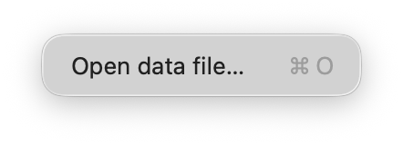 File |
Open data file… (Ctrl+O / ⌘O) |
Loads a .dat, .txt or .csv file and builds one graph per data column. See §4. |
Quit (Ctrl+Q / ⌘Q) |
Closes FrugalPlot. | |
| About FrugalPlot / About Qt | Version and licence information. | |
 Plot |
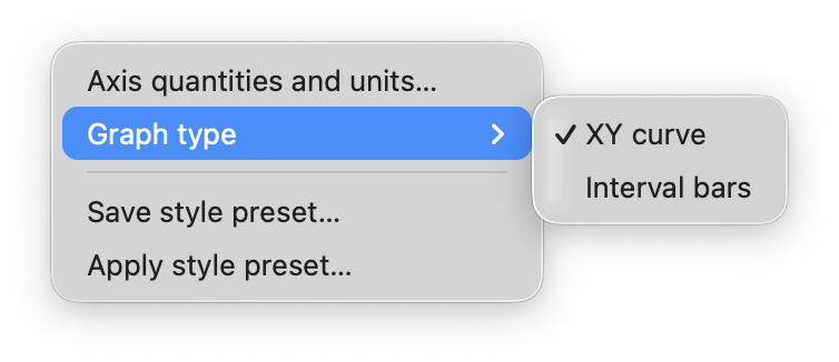
Axis quantities and units… | Sets what each axis of the focused graph measures (Voltage, Current, Phase/\(2\pi\), …) when the column header does not identify it. |
| Graph type ▸ XY curve / Interval bars | Redraws the data either as continuous XY curves (one graph per column) or as statistical interval bars. | |
| Save style preset… | Saves the focused graph's appearance — curve colours and styles, axis ranges and scales — to a file stored beside the data file, so it is reapplied automatically when that data file is reopened. | |
| Apply style preset… | Applies a previously saved style preset to the focused graph. | |
 Help |
FrugalPlot Documentation | Opens this manual in your web browser. |
On macOS, Quit and the About items appear in the system FrugalPlot application menu, so the File menu itself shows only Open data file…
4. Data format¶
FrugalPlot only reads space-separated .dat or comma-separated .csv data organized in column format.
The first column is the x-axis and is identical for all curves, while each subsequent column is the y-axis of a separate curve, placed by default in a separate graph upon loading data.
Files without a header or with a single-line header are accepted in the following formats:
- for .dat format:
time "V(30,0)" "P(30,0)" "I(IPULSE1)"ortime V(30,0) P(30,0) I(IPULSE1) - for .csv format:
time,"V(30,0)","P(30,0)","I(IPULSE1)"ortime,V(30,0),P(30,0),I(IPULSE1)
A data column whose header starts with a capital V, I or P is automatically interpreted as a voltage, current or phase. Its curve and its y-axis are labelled Voltage, Current or Phase accordingly; the phase axis reads Phase / \(2\pi\) and phase values are divided by \(2\pi\) before display.
Header matching is case-sensitive: lower-case initials (v(…), i(…), p(…)) and any other initial are not interpreted, and the column keeps its raw header (for example MyVoltage). Headers ending in _V, _I or _P (the text after the last underscore, JSIM style) are recognised the same way as the V / I / P prefixes.
When several columns resolve to the same name — for instance I(B1) and I(B2), both Current — those columns keep their raw headers so the curves stay distinguishable.
A column named time or Time, or otherwise the first column, is taken as the shared x-axis. FrugalPlot also recognises a few other quantities by header (Time, f / freq / frequency, temp / temperature, and any header ending in %); every unrecognised numeric column is plotted under its raw header.
FrugalEDA is open source software. For the latest updates and source code, visit our repository.